Portfolio
Designing scalable digital products and enterprise platforms. Focused on simplifying complex workflows through user-centered design.
OOPS Solution
Project: OOPS Solution
Role: Enterprise & B2B UX/UI Designer
Platform: UX architecture redesign,
Focus: UX Redesign, UI System and Scalability
| Context & Overview | OOPS.Solution is an internal airline back-office system used daily by airline staff to manage flights, pricing, seats, and onboard services. The project focused on redesigning an existing system that suffered from poor usability, inconsistent UI patterns, and high development complexity. |
| Problem Statement |
|
| UX Goals |
|
| UX Strategy & Design Approach |
|
| Solution Highlights |
|
| Results & Impact |
|
| Key UX/UI Skills Demonstrated |
|
Reflection
This project reflects my experience working with complex enterprise systems and shows how I approach UX problems with a balance of user needs, business goals, and technical constraints.Original Design (Before Redesign)
- Dense layout
- Unclear hierarchy
- Scattered actions
Redesigned Interface (After UX/UI Redesign)
- Clear structure
- Consistent layout
- Separated system functions
Before: Dense table, low readability, high cognitive load
After: Structured hierarchy, improved clarity, faster usability
UX/UI Case Study — Light & Dark Theme Strategy
Base Color Driven UI Theming
To support both Light and Dark themes efficiently, the UI was designed using a base-color-driven theming approach. Instead of redefining all UI colors, only the base colors were adjusted, while semantic colors and component behaviors remained consistent across themes. This approach significantly reduces design complexity, minimizes implementation effort, and ensures consistency across the system.Why change only base colors?
Redesigning every color for each theme often leads to inconsistency, longer design time, and higher risk of implementation errors. By defining a clear color hierarchy, the theme switch can be achieved by updating only the base color layer.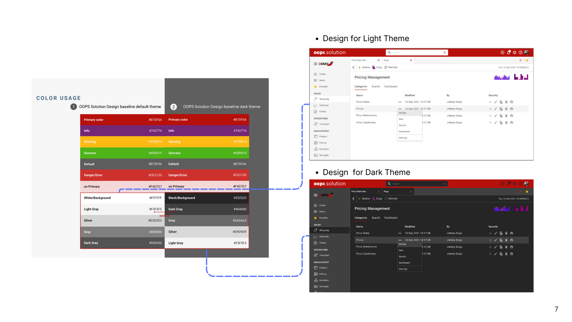
Color System Structure
Base colors define the overall visual tone of the interface and include:
- Background
- Surface
- Border
- Neutral text colors
Switching between Light and Dark themes only requires updating these base values.
Semantic colors such as Primary, Success, Warning, and Error remain the same across themes to preserve meaning and recognition.
SWIZE.ME
Project: SWIZE.ME
Role: UX/UI Designer
Platform: Application
Scope: Personal Data Flow, UI Design
Industry: Technology
| Context & Overview |
SWIZE.ME
is a consumer-centric platform that allows users to manage and share personal data securely
across services.
The platform focuses on enabling user-controlled data sharing while maintaining privacy and transparency. |
| Problem |
Users repeatedly enter the same personal data across different
platforms.
Existing solutions often:
|
| Design Goal |
Design a consent-first data sharing flow that allows users to:
|
| System Flow |
User
|
| UX Strategy |
|
| Core UX Concept |
|
| UX Focus |
|
UX/UI Case Study — Preference Discovery UI
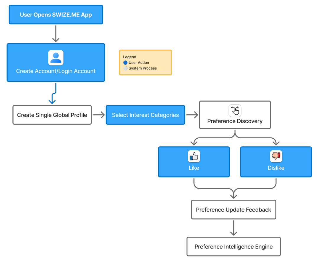
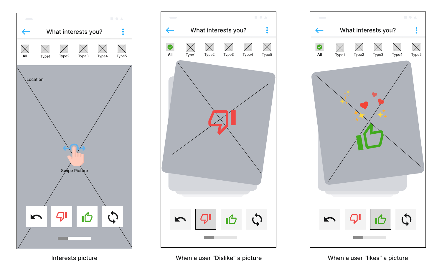
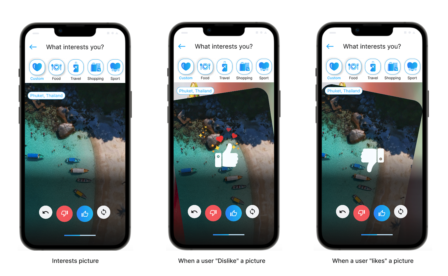
This screen is one of the core interactions in the SWIZE.ME app. It allows users to express what they are interested in by swiping cards, instead of filling out forms or answering long questionnaires.
Content is presented one card at a time so users can focus on a single decision.
| Purpose of This Interaction |
|
| Swipe Actions (Like / Dislike) |
|
| Visual Hierarchy |
|
| UX Outcome |
|
| Key Takeaway | Swipe interactions turn preference selection into a natural part of the experience, rather than a setup task. |
UX/UI Case Study — Consent & QR Sharing Flow UI
After the system has learned user preferences through swipe interactions, the next challenge is enabling data sharing without compromising user trust or privacy.
This flow focuses on how SWIZE.ME allows users to share their personal data only when they choose to, using a consent-first approach.
| Problem Statement |
Users often need to repeatedly enter the same personal information when accessing
new platforms. Existing solutions either:
|
| Goal |
Users are presented with a clear consent screen that explains:
|
| Separation of Roles |
|
| Key UX | Consent should feel like empowerment, not a barrier. |
| UX Impact |
|
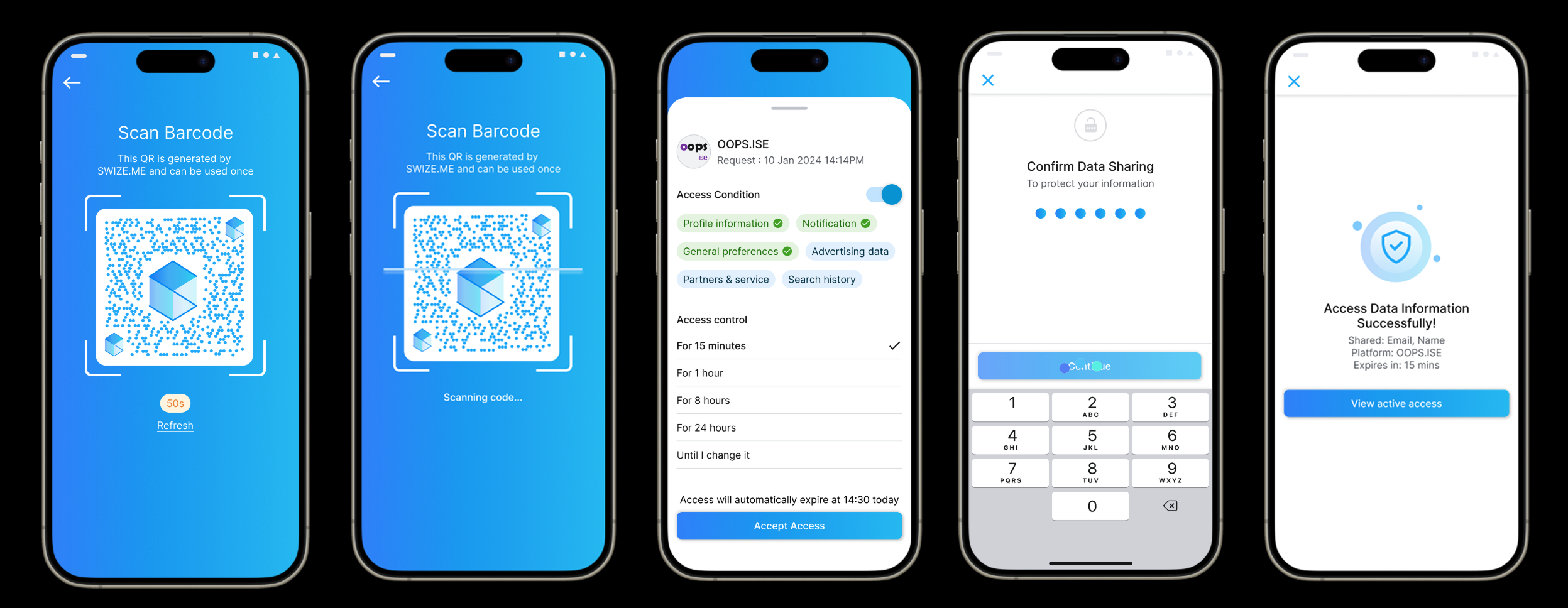
Outcome
The final flow provides a secure, intuitive data-sharing experience that aligns with fintech and digital identity standards, while maintaining user trust and usability.OOPS ISE
Project: OOPS ISE
Role: Enterprise & B2B2C UX/UI Designer
Platform: Web (Responsive: Desktop, Tablet, Mobile)
Scope: Flight Search, Booking Flow, UI Design
Industry: Airline / Travel Tech
| Context & Overview | OOPS.ISE is a customer-facing front-end platform that enables passengers to search for flights, book tickets, and purchase ancillary services through a web-based interface. Unlike OOPS Solution, which is designed for internal airline staff, OOPS ISE focuses on delivering a seamless and intuitive experience for end users. |
| My Role & Responsibilities | In the OOPS ISE project, I worked as a UX/UI Designer responsible for designing the end-to-end passenger booking experience. My responsibilities included creating wireframes and prototypes for the booking flow, designing a scalable UI system, and defining responsive layouts that support desktop, tablet, and mobile screen sizes across multiple airline websites. |
| Product Goals |
|
| Key Features & UX Scope |
Flight Search & Selection
|
| UX/UI Design Approach |
|
| UX/UI Skills Demonstrated |
|
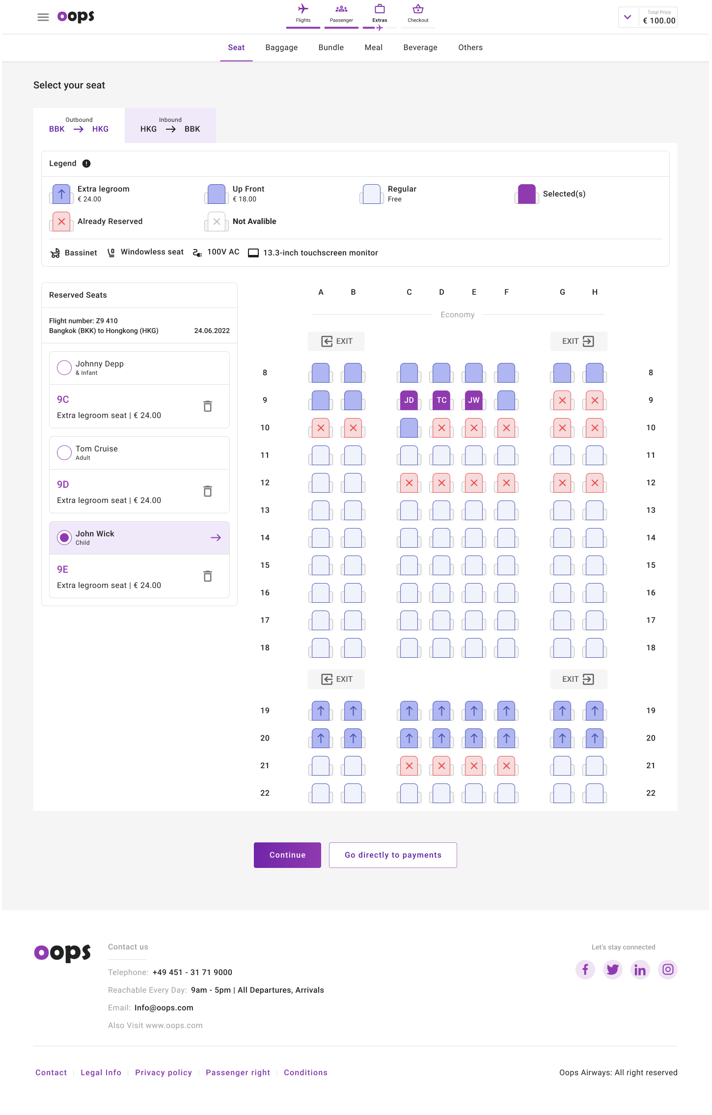
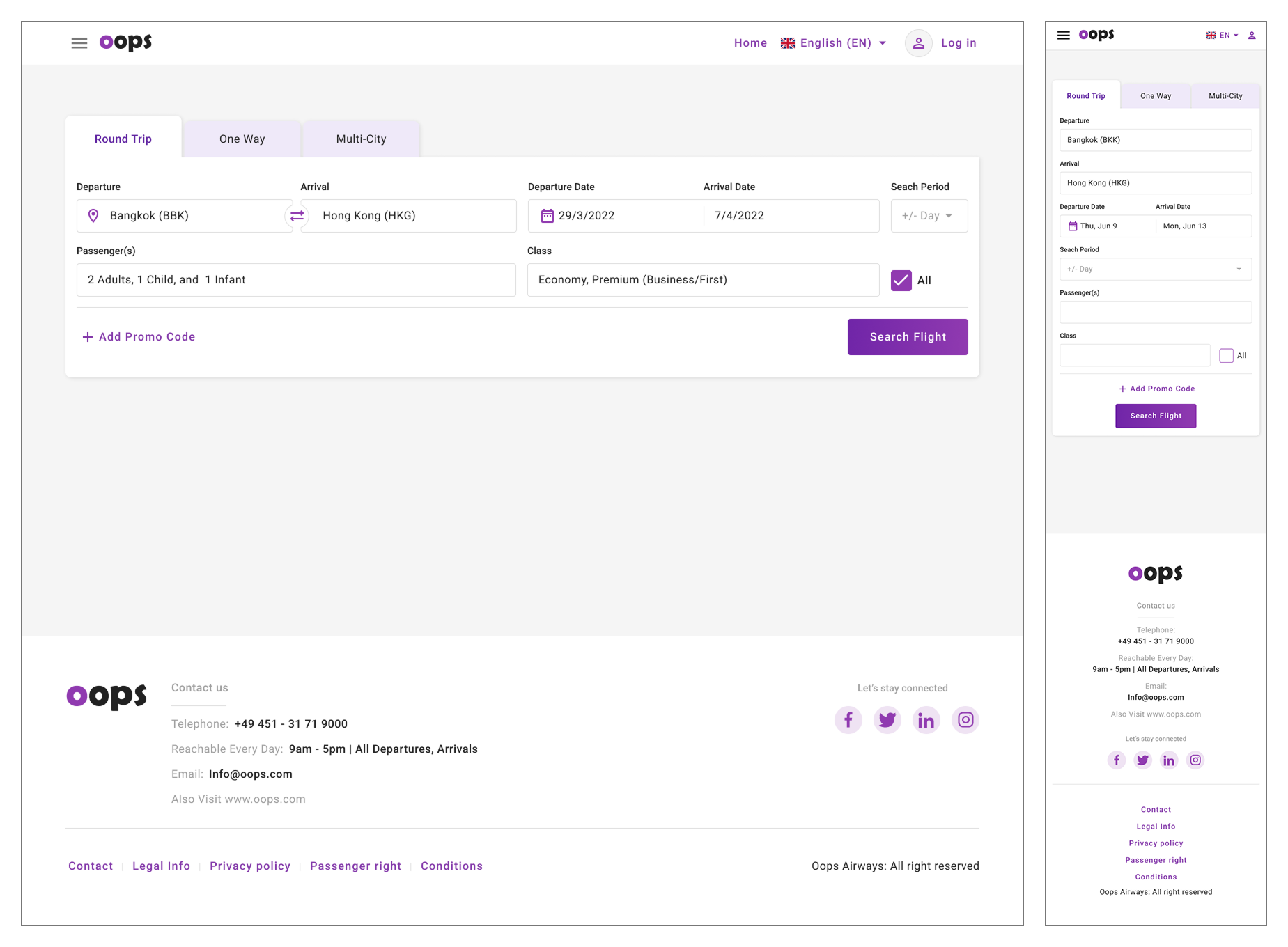
UX/UI Case Study — Flight Booking
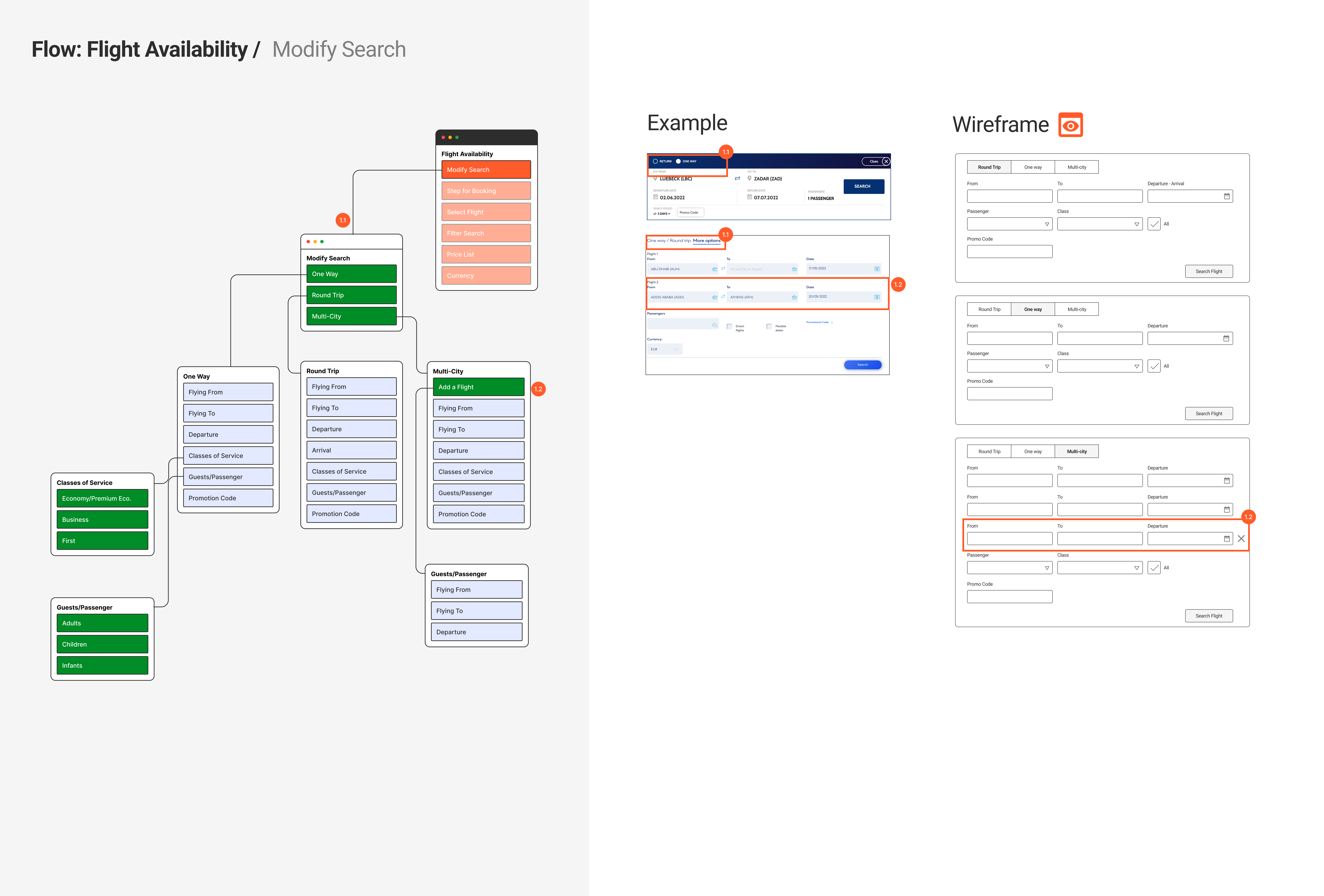
Designing a scalable and responsive flight search experience for One-way, Round Trip, and Multi-city bookings.
Overview of the flight booking interface designed to support multiple travel scenarios with a consistent UX structure.
Problem Statement & Design Goals
- Users have different travel needs, from simple one-way trips to complex multi-city itineraries.
- The challenge was to design a flight search interface that supports complexity without overwhelming users.
- The solution needed to be scalable and adaptable for multiple airline brands.
Flight Search Flow Structure
Flight search flow illustrating how different trip types share a consistent structure while supporting varying levels of complexity.
1. Round Trip Flight Search
Round Trip Flight Search - Clear Date Relationship
The Round Trip flow extends the One-way structure by introducing return date selection, while maintaining a familiar layout to minimize relearning.
UX Highlights
- Consistent layout with One-way flow
- Visual grouping of departure and return dates
- Support for flexible date search (+/- day)
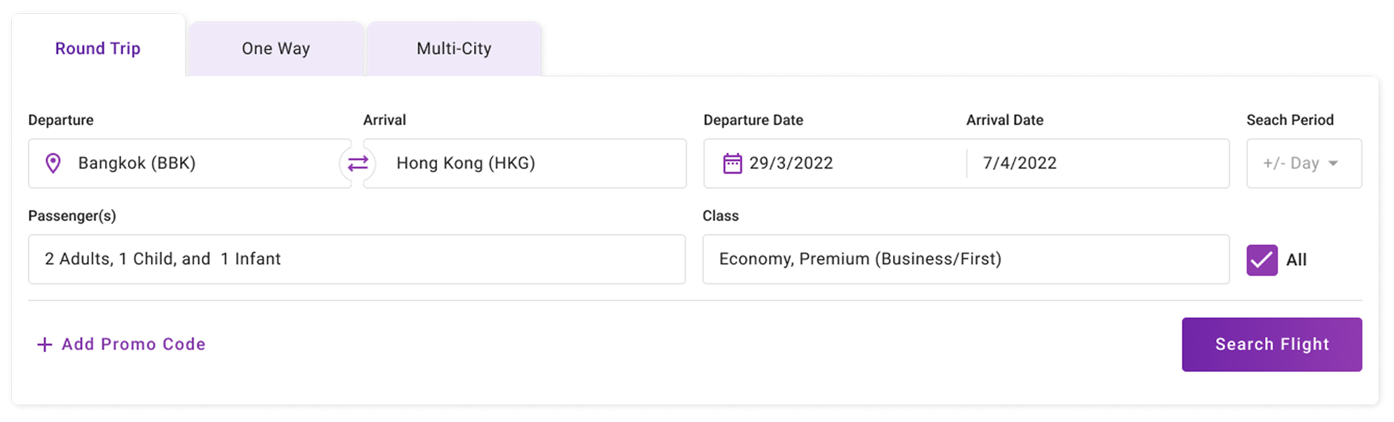
2. One-way Flight Search
One-way Flight Search - Simple & Fast Booking
The One-way flow prioritizes speed and simplicity by limiting inputs to essential fields only, reducing cognitive load for users with straightforward travel needs.
UX Highlights
- Minimal required input fields
- Clear linear reading order
- Strong emphasis on the primary CTA
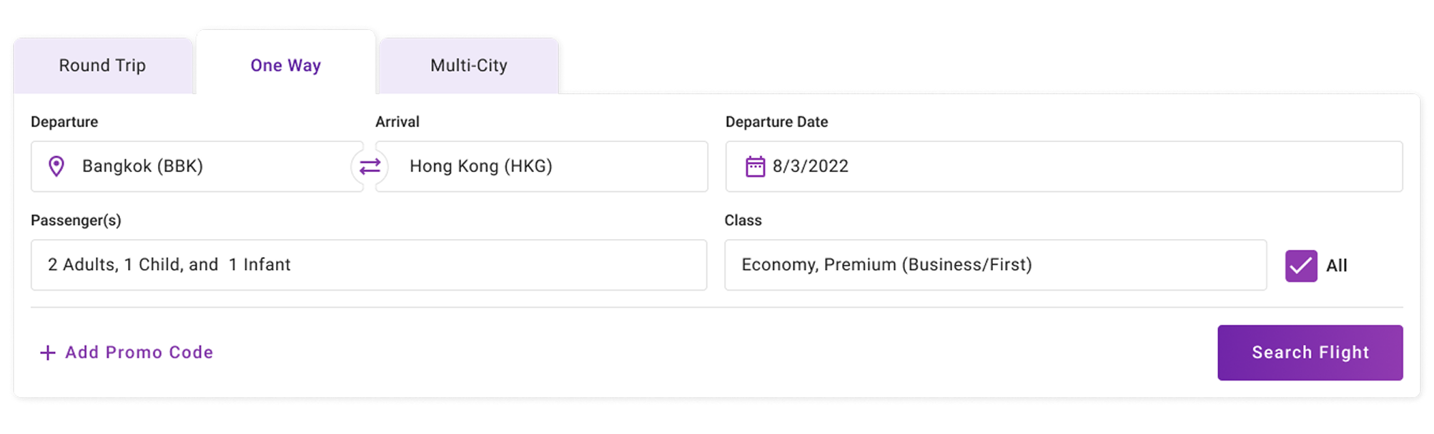
3. Multi-city Flight Search
Multi-city Flight Search - Complex Trips Made Manageable
The Multi-city flow supports advanced itineraries by allowing users to add flight segments progressively, while maintaining consistent input patterns across each leg.
UX Highlights
- Repeatable segment structure
- Clear separation between flight legs
- Scalable design for complex journeys
UX Improvement Opportunities
- Progressive disclosure to reduce initial visual complexity In the current design, users are presented with multiple input fields at once, especially in Round Trip and Multi-city flows. While this supports flexibility, it may introduce unnecessary cognitive load for first-time or casual users.
- Enhanced visual emphasis on primary CTA when inputs are complete The “Search Flight” button is clearly visible, but its importance could be reinforced through dynamic visual feedback based on user progress.
- Collapsible sections for improved mobile usability On smaller screens, long forms can become overwhelming. While the current layout supports responsiveness, additional mobile-specific UX adjustments could improve usability further.
Reflection & Outcome
Design Reflection
This project demonstrates my approach to designing complex booking systems by balancing usability, scalability, and business requirements. By maintaining consistent UX patterns across all flight search types, users can move between booking scenarios with minimal friction.
A scalable flight booking experience designed to support multiple airline brands while keeping the user journey clear and intuitive.
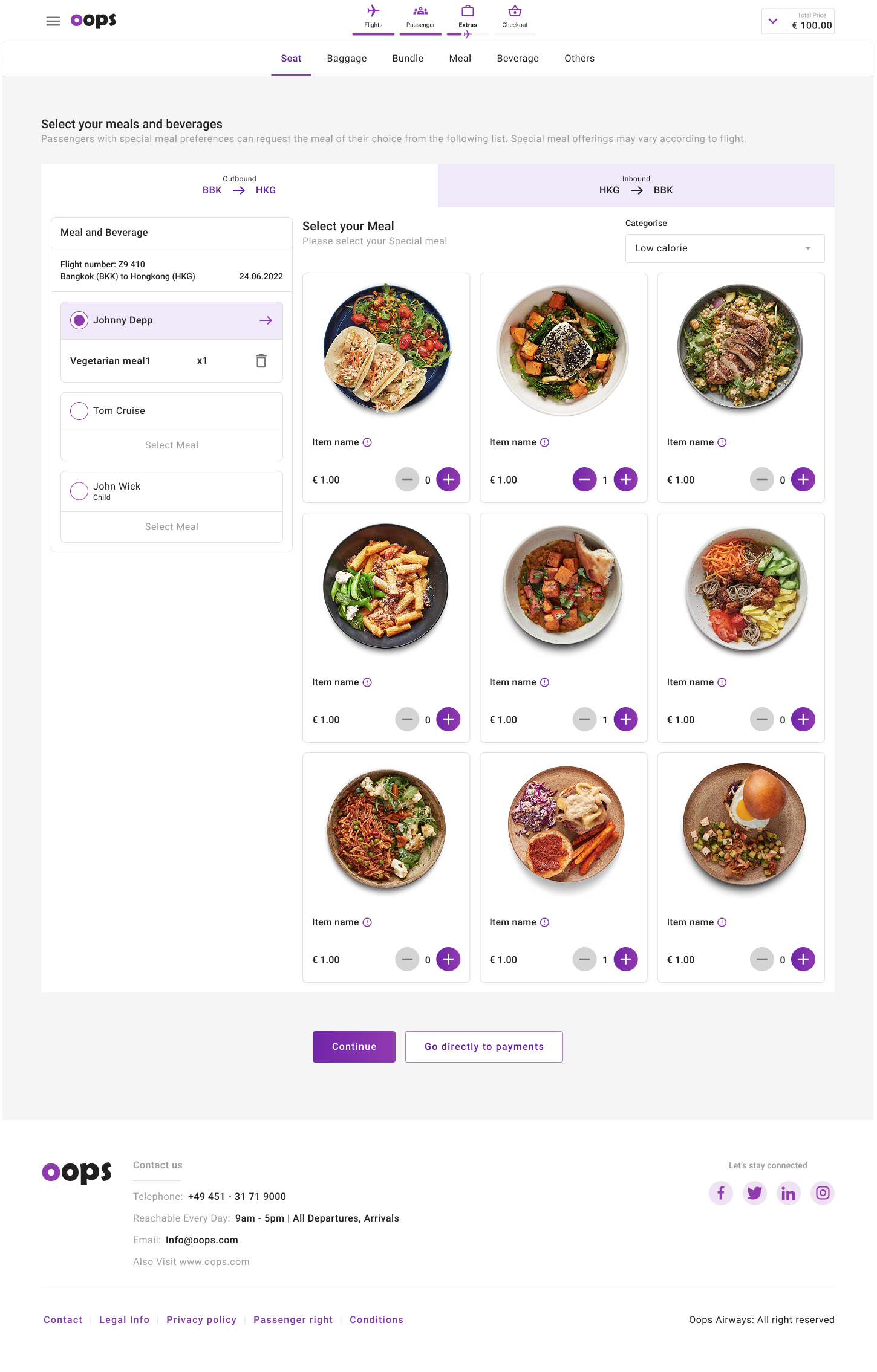
Onboard Services Design
1. Meal and Beverage Design
2. Seat Map Design